
When we read a headline, we're rarely looking at the evidence ourselves. We're looking at someone else's interpretation of the evidence. That doesn't necessarily make the headline wrong. It does mean we're trusting someone else's conclusions. My mother used to ask me a simple question:
"Do you believe everything someone tells you?"
That question has stayed with me for years. It doesn't mean assuming people are dishonest. It means recognizing that every graph, every statistic, and every news story has already been interpreted before it reaches us. Sometimes I wonder what happens when we look at the data ourselves.
The question that started it
In 2013, nineteen members of the Granite Mountain Hotshots lost their lives while battling the Yarnell Hill Fire in Arizona. It was a tragic event. As the story spread across the country, many news reports connected the fire to global warming. That made me curious. I wanted to understand what the underlying temperature data actually looked like. Could I see it for myself?
At the time, obtaining decades of historical weather data wasn't easy. Today it's much simpler. Open-source tools and freely available weather records allow anyone with a little curiosity to explore long-term trends.
Seeing instead of being told
One of the things I enjoy about engineering is that, whenever possible, you can inspect the evidence yourself.
Instead of asking, “What should I believe?”
Ask, "What does the data actually show?"
That's a different question. Rather than relying only on summaries or headlines, you can download historical weather records, plot them, and begin exploring. Not to win an argument, to understand.
My "fat pencil" test
Whenever I look at a large set of data, I like to imagine laying a thick marker across the graph. Not literally. Mentally. Weather changes every day.Temperatures rise and fall. Some years are hotter. Others are cooler.
Rather than becoming distracted by every individual point, I ask a simpler question. If I covered all those daily ups and downs with a fat marker… Would the marker point upward? Downward? Or roughly flat?
I call this the fat pencil test. It's not a formal statistical method. It's a simple a way to not mistake short-term variation for long-term patterns. The broader trend is often more important than individual points.
The importance of context
When I explored temperature records for Phoenix, Arizona, something interesting appeared. The overnight low temperatures seemed to show more warming than the daytime highs.
One possible explanation has nothing to do with global climate. Phoenix today isn't the Phoenix of fifty years ago. There are more roads. More buildings. More concrete. More pavement. More vehicles. Cities often retain heat overnight more effectively than surrounding rural areas—a phenomenon commonly called the urban heat island effect.
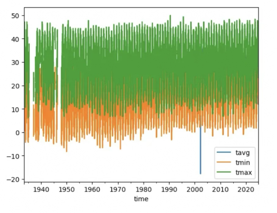
That doesn't prove or disprove anything about broader climate trends. It simply illustrates an important principle. Context matters. Whenever we observe a pattern, multiple explanations may be possible. The challenge is separating them.
Better questions produce better conclusions
Suppose someone says: "Arizona is getting warmer."
A question immediately comes to mind. Compared to what? One weather station? Ten? Urban locations? Rural locations? Over what time period? Were the stations moved? Were measurement methods changed? Missing data filled in? None of these questions imply that the conclusion is wrong. They help us understand how the conclusion was reached.
Curiosity is more valuable than certainty
One of the reasons I enjoy exploring data is that it encourages curiosity over certainty. The goal isn't to defend a position. The goal is to understand reality a little better than I did yesterday. Sometimes the evidence supports what I expected. Sometimes it doesn't. Either way, I've learned something.
You don't have to be an expert
Years ago, exploring historical weather data required specialized software and expensive datasets. Today, many of these resources are freely available. With open-source programming tools such as Python, almost anyone can visualize decades of weather observations in a matter of minutes.
You don't need to become a climate scientist. You simply need to be curious enough to ask:
Can I see the data myself?
Question the conclusion—or the question?
This experience reinforced something I've found true across many subjects. Whether we're discussing climate, economics, health, artificial intelligence, or politics, we often spend our time arguing about conclusions. Far less often do we examine the process that produced them.
- Who collected the data?
- How was it analyzed?
- What assumptions were made?
- What alternative explanations were considered?
Those questions don't undermine science. They strengthen it. Science advances by making evidence available for others to inspect, question, and reproduce. That's why I keep returning to the same idea across so many different subjects.
The way we define a problem—and the questions we choose to ask—shape the conclusions we reach.
The most valuable question isn't whether a headline is true. It's :
Can I see the data for myself?
Related Articles
What If We Solved Climate Change Without Reducing CO₂?
What are we trying to change?
How to Plot Temperature Data Yourself
How to Obtain and Plot Weather Temperature Data
About the Author
Daniel Stih (danielstih.com) is an aerospace engineer, software engineer, indoor environmental consultant, and author of 12 books. For more 30 years, he has investigated complex problems spanning engineering, technology, the built environment, and human decision-making. His work explores how evidence, assumptions, and systems shape the conclusions we draw—and whether we're solving the right problem. Learn more about his approach in Why I Think This Way.