
Want to see the data instead of only reading the headline? Here’s a simple way to start.
First, install Anaconda. It gives you an easy way to run Python without needing to be a programmer. After installing it, open Spyder, which is a free Python editor included with Anaconda. Next, install the Meteostat package by running:
pip install meteostat
Then use the script below to pull historical daily temperature data at Phoenix Sky Harbor Airport, one of the longest-running weather stations in the Phoenix area, and one with few missing data points compared to other locations you might search for.
from datetime import datetime
import matplotlib.pyplot as plt
from meteostat import Point, Daily, Stations
stations = Stations()
stations = stations.nearby(33.4342, -112.0119)
station = stations.fetch(1)
print(station)
start = datetime(1895, 1, 1)
end = datetime(2024, 11, 1)
location = Point(33.4347, -112.011)
data = Daily(location, start, end)
data = data.fetch()
data.plot(y=['tavg', 'tmin', 'tmax'])
plt.show()
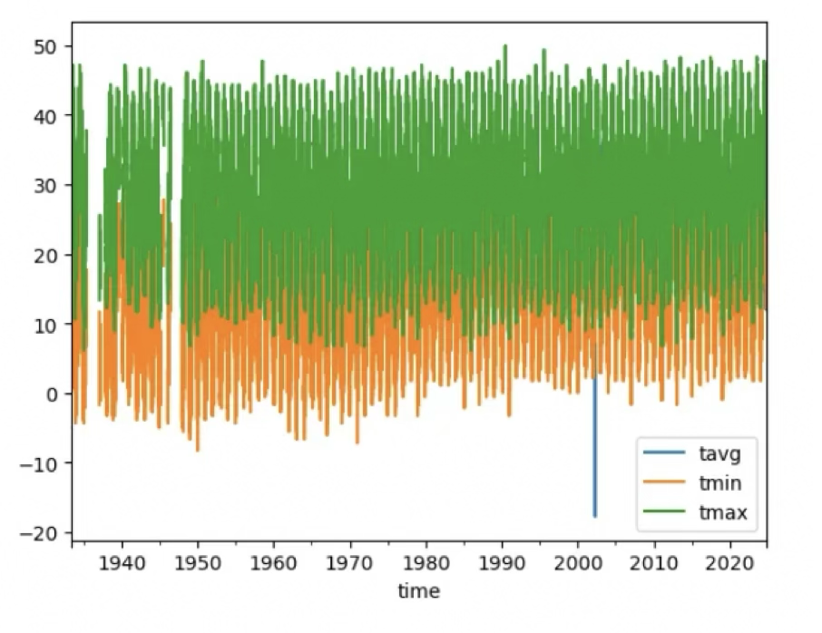
This will plot:
tavg (average daily temperature)
tmin (daily low temperature)
tmax (daily high temperature)
Once the graph appears, look for a pattern. Are highs rising? Are lows rising? Are there missing years or strange gaps? Does the trend look different depending on whether you examine minimum, maximum, or average temperature?
That’s the point of the exercise: not to prove a conclusion. It's to practice looking for yourself.
Strengths of this approach
- Transparency: working with raw data avoids black-box summaries, It lets you check assumptions and see things for yourself.
- Station-level insight: single stations reveal local effects (growth) and allows you to check the data for instrumentation changes and station location changes.
- Focus on Tmax vs Tmin: Tmin (nighttime minimum) often rises with urbanization, Tmax may be influenced by regional factors. Or not.
Key methodological caveats (so your data and conclusions are robust)
If you want a robust interpretation, check these factors:
- Station metadata (station moves, instrument changes, location siting): changes in station location or instruments can create artificial jumps/trends. Homogenization methods are used by climate centers to correct for these, changes not disclosed to those who use homogenized date . By downloading your own RAW data you can see everything yourself.
- Urban Heat Island (UHI): local development (airports, pavement, buildings) may raise nighttime temperatures and bias local trends.
- Homogenization vs raw: curated datasets (NOAA GHCN, NASA GISS, HadCRUT) apply homogenization algorithms to account for non-climatic station changes, missing data points (days the weather station was down) and delete data points it considers to be “flyers”, anomalies. This editing, considered by some to be a legitimate statistical process, is not transparent and prevents common man from “seeing it for yourself.” It’s not disclosed what gets adjusted and why - you just see someone else’s plot or the data they created.
-
Record length and sample size: one station over 100 years is more valuable and logical than global conclusions that use many stations and spatial averaging. You can never have enough weather stations around the world. No such data exists going back a century or more.
Practical reproducible checklist: how to validate your analysis
- Consider station metadata: instrument changes and station moves.
- Compare raw vs homogenized datasets: download the raw station record data and compare that to its homogenized counterpart (NOAA GHCN-Daily, NASA GISS station series, etc.).
- Plot more than maximum temperature. Plot the Tmax, Tmin, daily mean.
- Document everything: publish code/scripts and data sources so others can reproduce your work.